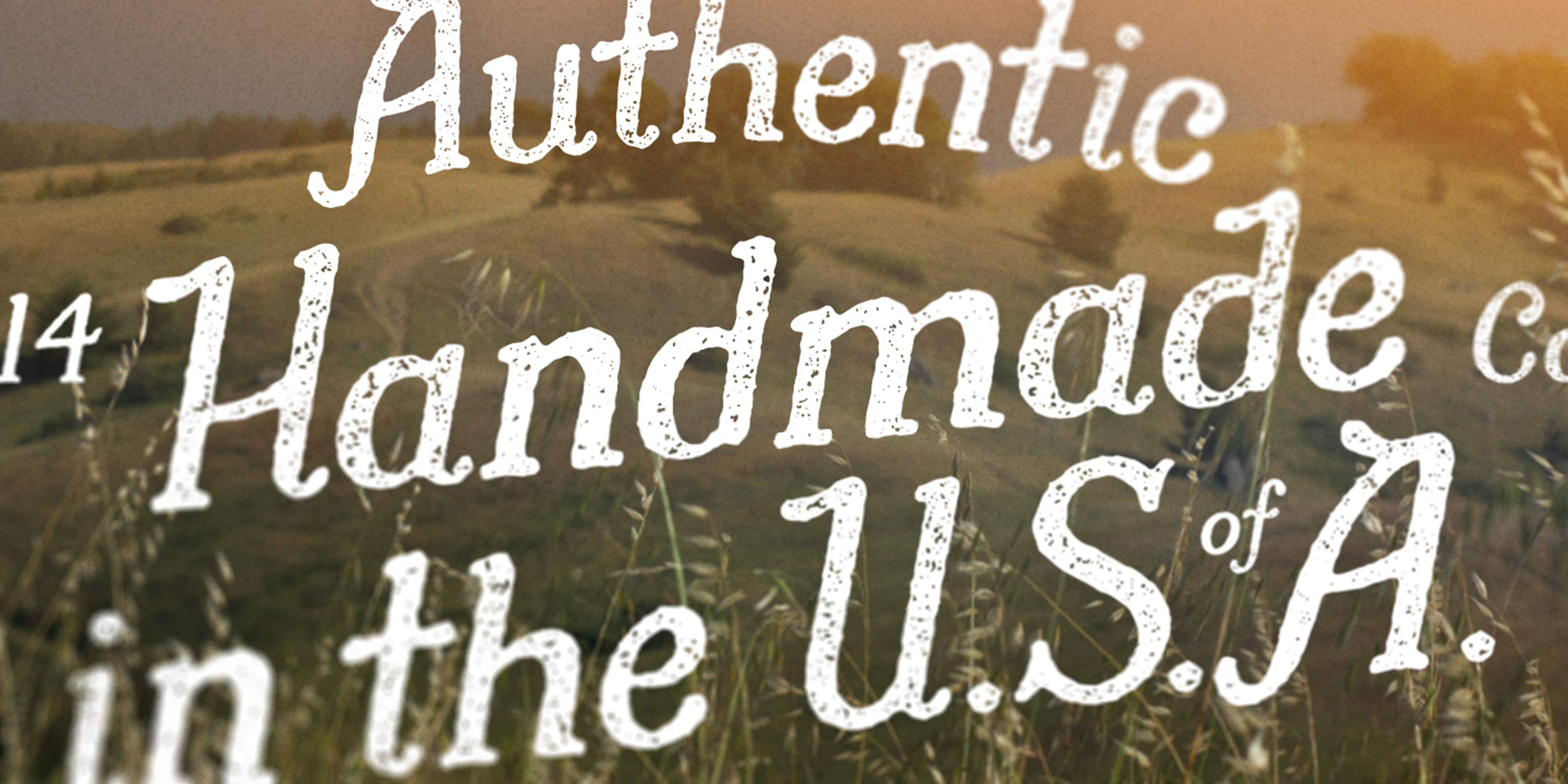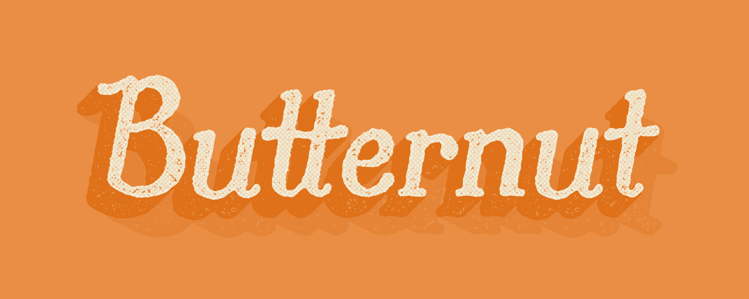
Butternut’s starting point was writing by hand with a felt-tipped marker. The feel of the letterforms, the rounded serif details, and the organic, rough quality, were informed by the limitations of the thick marks made.
The result is a warm and cozy, font family, hearkening to country mom and pop store signage, vintage labels, and hand-hewn curios. Carefully considered, but well-loved.
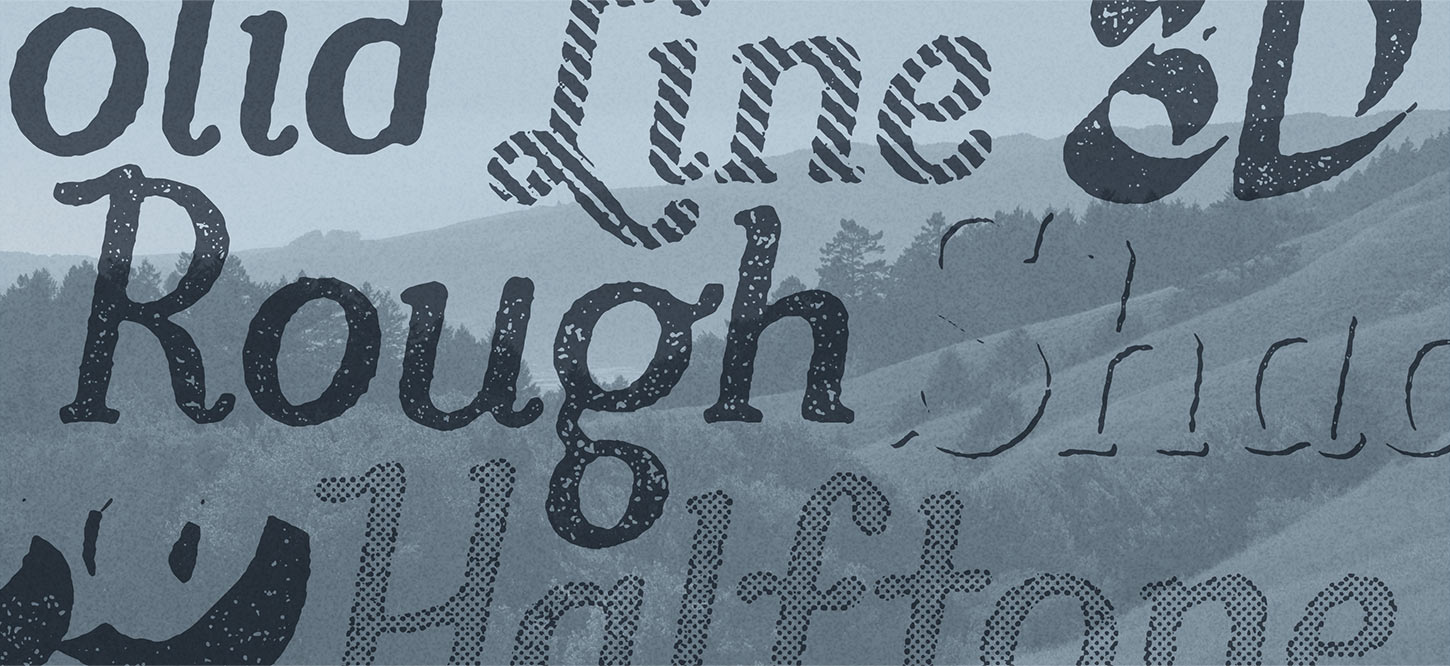
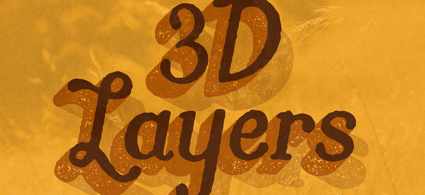
Butternut comes in multiple textures and can be layered with Butternut Rough 3D and Butternut Rough 3D Shadow for even more depth.